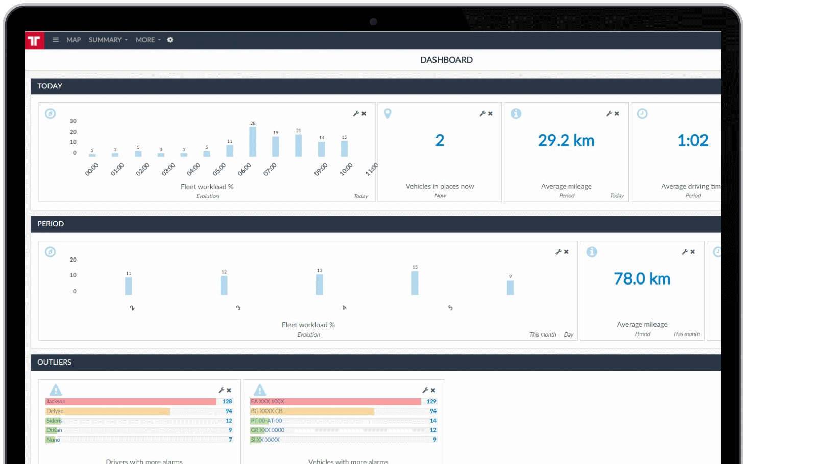
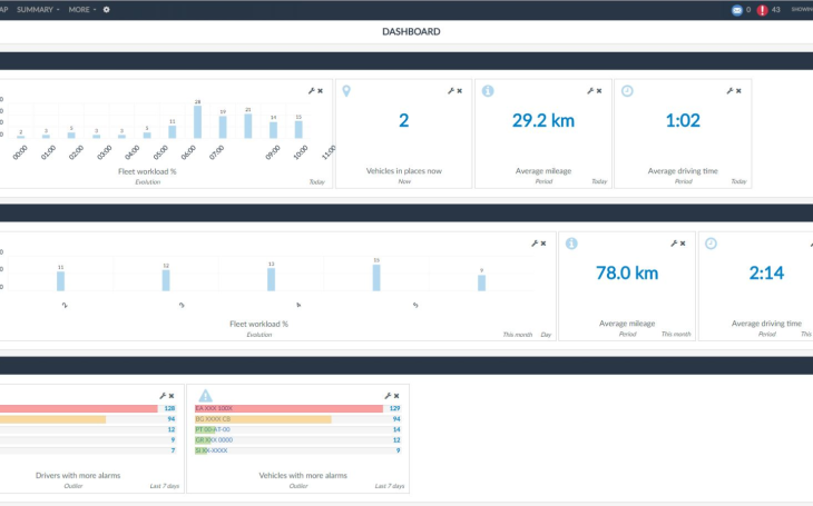
Your management team wants a simple visual way to know how the main performance indicators for the fleet are evolving. Is the fleet near its workload limit? How much further can it perform? How’s the current activity in comparison to the last months?
This powerful tool is configurable to fit your needs, allowing you to change the selection of KPIs, create new groups of indicators and reorganize them easily through drag & drop moves.
By default, your account will already be configured to show some of the available KPIs for your fleet. You can change the selection of KPIs and corresponding groups according to your own preferences.
The dashboard is composed of vertical panels called groups. Inside each group, you can display the KPIs or Indicators.
You can add various indicators in each group. Indicators are organized in 5 different types: Now, Period, Map, Outliers and Evolution.
There are several indicators within each type, such as Fleet workload, Vehicles in transit, Average mileage, Average driving time, Drivers with more alarms, Average alarms per vehicle and many others.
Main features
● Simple and easy - Aggregates important information about your fleet’s performance in an easy to read format.
● Flexible and customizable - Manage which KPI’s to show according to your company needs and organize the layout according to your preferences.
● Default configuration - For an easy start.
● Global overview of fleet performance – See the performance of your fleet in one glance.


